Bar Project Major 1.3
Week 1
Week 2
In the first week I collected a lot of images that I liked and reflected the atmosphere I wanted to create. From these images I made a few collages and cut out the most interesting materials I found. I also made several small sketches of spaces I liked/could relate my ideas to.
First Concept Text(unused)
Concept – Liminal Space/Transition
What/ How?
I would like to create a bar that uses the principles of liminal space to create a club experience that feels safe and comfortable for all in the aftermath of the corona pandemic. I am also inspired by the huge amount of space offered at the Schiecentrale and feel that it should be taken advantage of. The space would put a big focus on the entrance and exit, as well as the transition between different spaces such as the bar and the dancefloor. I will emphasise these transition spaces by using a lot of contrast, such as narrow hallways that open into wide rooms. In order to prevent people from having to get super close to each other in order to speak (as you would in a normal club where the music is loud), the club will use a silent disco which allows people to simply remove their headphones to have normal conversations. People would also be able to switch between different ‘stations’ run by different DJ’s and would be encouraged to explore the space as they do this.
Why?
In recent years the term ‘liminal space’ has taken on a huge number of different meanings, all of which I feel are relevant to the location and history of the Schiecentrale, the current situation we find ourselves in (corona), and the appeal of nightclubs as a service/product. The word liminal originates from the Latin term ‘limen’, meaning ‘threshold’, or in simpler terms, the space of ‘crossing over’. I feel that this relates strongly to nightclubs and club culture as an environment for transition. Nightclubs have been used as vessels for transition and change, especially in regard to fashion, music, and other aspects of pop culture since the early 20th century and I would like to design a space that encourages its visitors to experiment with self-expression in this transitional space. Furthermore, the future of nightlife itself is facing a period of huge transition as a result of the coronavirus and I anticipate that many people will no longer feel comfortable in a traditional crowded club setting. Physically, this project would aim to provide a much larger space with the same intimate feeling as smaller bars.
Concept – ‘Nowhere to Hide’
What/ How?
I would like to create a bar that encourages social interaction once the covid pandemic is over. Surveys by the BBC and NY Times have shown that many people feel that their social skills have declined during the pandemic as a result of mostly digital interactions for months on end, and I would like to create a space that puts people out of their comfort zone. Ideally, the space would be large, but arranged in such a way that you can always see everyone inside the bar (for example by using mirrors). Additionally, it will have a grand entrance such as a staircase or hallway that opens into the centre of the room, so that all visitors ‘make an entrance’ (they must do this on their own, even if they’re in a group). The entrance will have its own announcer that announces the name and age of each visitor, in order to relive the pressure of making a first introduction with a stranger. The most important part of the bar will be a long table that extends and curves around the entire space, with no private tables available (similar to shared tables in cafés).
Why?
Many different surveys and investigations have shown that months of isolation have negatively affected our social skills. A report by the BBC stated that “Overall, psychologists are seeing more adults report stress over social interactions, ranging from not knowing how to bookend interactions without a handshake or a hug, to running out of things to talk about”. I think that small gestures such as shared tables and couches can encourage people to interact with each other without it feeling too forced. I also feel that being forced to enter alone into a large room puts can put people out of their comfort zone which is necessary to improve our social skills.
- Texture Library
Deliverables
- Plan & Section
- Concept Text
- Rhino & Twin Motion Models
During this week, I revised my concept text and decided to focus on the main feature of the space, which was a long twisting table and curved walls.In changing my concept text I also did read several articles to inform the 'why' portion of the text. I also decided on a location for my bar, which was the basement. This helped me to envision an atmosphere and accompanying materials. I made a charcoal sketch of my initial idea, as well as a section of a possible interior.
Second Concept Text(unused)
Feedback
"Een aandoenlijk en mooi streven om de sociale skills weer wat op te krikken, probeer hier eens een sterk artistiek standpunt in in te nemen. In Coney Island kon je vroeger in een draaiende ton stappen en dan kwam er aan de andere kant een vreemde in, je rollebolde dan over elkaar heen en daarna ging je samen met die vreemde in een bootje varen. zoiets? Of anders? Hoe? En hoe moet dat er dan uitzien? Welke ontwerpers zijn een referentie? Waarom? neem wat sterker stelling. succes!"
Week 3
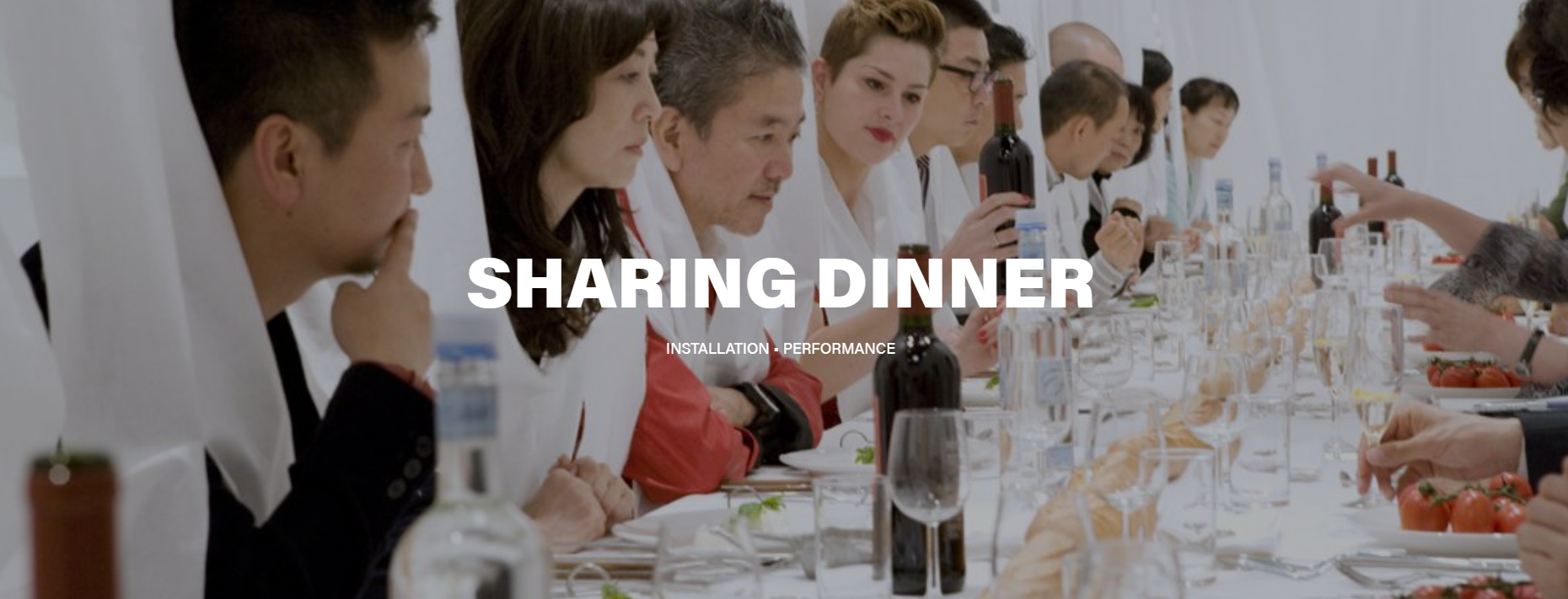
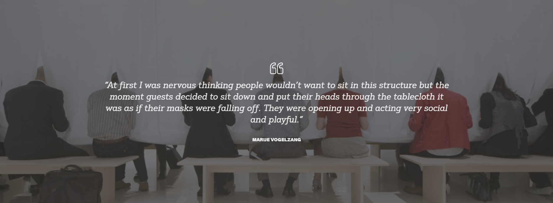
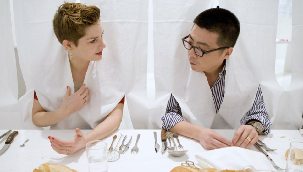
Following the feedback I recieved on my text, I made one last change to my concept. This concept, called 'De Keukentafel' was heavily inspired by the work of performance artist Marije Vogelzang (specifically her project 'Sharing Dinner'). In this project, she invited several strangers from different backgrounds to come together and share a meal. Instead of putting a tablecloth over the table, she hung the cloth vertically from the ceiling and asked the guests to cut a hole and stick their head through. This project inspired me for two reasons - firstly, Marije commented on the fact that the strangers were suddenly much more open with eachother once they were connected physically through the tablecloth draping around their necks. I found this interaction between a physical and spiritual connection very interesting. I also admire this project due to its simplicity - Vogelzang creates a whole new world and space within an otherwise empty room with one very simply gesture.
Third Concept Text(Final draft)
Concept – De Keukentafel
What?
De Keukentafel (‘The Kitchen Table’) is a bar and restaurant designed to change the way we approach social interactions in nightlife. Rather than collecting a group of friends and reserving a table for the night, De Keukentafel encourages its visitors to come alone and simply ‘schuif aan’ (just ‘join in’) at a table with a group of strangers. The main feature of the bar is thus one long table which curves around the space, leading into an open kitchen where the food is prepared but where visitors are welcome to enter to socialize with the chefs themselves. The aim is to allow guests to feel like they are simply at a friend’s home, free to help themselves to a glass of wine or a friendly chat.
Why?
I chose the idea of a kitchen specifically due to its familiarity – when we are meeting unfamiliar people and are forced to act out of our comfort zone, it can be comforting to be in a setting that is familiar and ‘homely’ to us. I feel that meeting and interacting with people is more important now than ever coming out of a year of lockdowns with severe restrictions impacting our social well-being. Surveys by the BBC and NY Times have shown that many people feel that their social skills have declined during the pandemic as a result of mostly digital interactions for months on end, and I would like to create a space that puts people out of their comfort zone. This idea was also informed and inspired by the project ‘Sharing Dinner’ by Marije Vogelzang. In particular, I admired her ability to transform the physical connection of having a shared tablecloth into an emotional connection, as well as her ability to create a space within a space which takes on a life of its own, with one very simple gesture.
How?
The bar is located in the basement of the Schiecentrale, with stairs leading down from the south end of the building. The main feature of the bar will be the kitchen table which twists around the space, as well as curved walls and vaults in the ceiling to amplify the sound. I chose the basement because of its simplicity and roughness, as well as the fact that it currently feels like a liminal space, which I would like to challenge in order to transform it into a cozy bar space, or make it ‘gezellig’ as we say in Dutch. The bar will also function as a café during the day, with the table operating as a ‘shared workspace’ open to both individuals and groups needing a place to work or study – just as you would use your own kitchen table at home.


I continued developing my concept by making some spatial collages focusing mainly on the materials I wanted to use. I also took some photos in the basement and used these for a collage, in order to see if the materials I had chosen would fit within the existing atmosphere. During this week I also started experimenting with Rhino, learning the basic functions an trying to visualize some of my earlier sketches.
Week 4 (Pitch Week)
During week 4 I mainly focused on gathering materials and preparing for the pitch presentation. I made two more collages focusing specifically on the atmosphere I wanted to create and included people in these collages, unlike in my previous collages. For the final pitch I also prepared a poster presenting the idea with its main 'unique selling points'.
Week 5
Week 6
Week 7
After presenting my pitch I worked almost entirely within Rhino and Twin Motion. I started by creating somewhat of a frame using the existing plans of the building, and then thought about the composition of the space. One of the first steps I took was creating the vaults in the ceiling and sculpting the curved walls. I then experimented with different shapes for the table. I took me a long time before I figured out a method to have one long table without having a lot of wasted space (I created an elevation change in the table to allow people to walk into the space created by the table).
During week 6 I imported what I had so far into Twin motion and bagan experimenting with lighting and materials. Putting my work into Twinmotion exposed a lot of small discrepancies and errors, so I spent a lot of time correcting my rhino model (e.g. walls not being properly conjoined etc.). I also made a section of the space and experimented with creating atmosphere in the section using photoshop.
One of the main problems I encountered was having strange shadows for which I could not find the source (like on the kitchen wall in the image above). I ended up having to rework alot of my rhino model from scratch.
In the final week I mainly worked out the smaller details of my model in Twinmotion (for example, adding people, glasses, bar stools, kitchenware and a lamp etc.). I also added a toilet on the North end of the space. Upon completing the model I made my final plan and section, exported my renderings, compiled my texture library, and made a few small changes to my concept text. You can access all of the final deliverables via the link below
Final Deliverables
- Rhino & Twin Motion Models
- Concept Text
- Plan & Section
- Plan & Section
- Texture Library